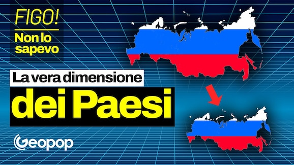
Looking at a world map hanging on a classroom wall, Greenland seems huge, about the size of all of Africa, but that’s an illusion. In fact, there are fourteen “Greenlands” in Africa. This is not the only case in which the map deceives us about the proportions and real dimensions of the countries of the world.
This deformation was born in 1569 with the projection of the Flemish cartographer Mercator, created to facilitate navigation and became a world standard, and cartographers have been denouncing its limits for over a century. Last September 4, the United Nations General Assembly adopted, with 164 yes votes, only one against and 6 abstentionsresolution A/RES/80/307, “Correct the Map”, to recommend that governments, schools, international organizations and other entities stop representing the Earth according to Mercator and adopt a map more faithful to its real dimensions, called “Equal Earth”.
This is a historic event, reported by the press around the world as the UN’s attempt to return to Africa a map that more faithfully respects its dimensions. This vote, however, for the moment not forces anyone to do anything: it is in fact a non-binding text, a recommendation. But if there is no authority capable of imposing a map, who has decided and will decide which is the “right” one?
Who decides the map of the world: the resolution voted by the UN
The resolution approved in New York is called “Fix the map: rebalancing the global cartographic representation and promoting a fair representation of the regions of the world, in particular Africa” and is the culmination of a campaign promoted by the African Union and brought to the UN by Togo, which presented the resolution on behalf of the Group of African States, also supported by the Caribbean Community (CARICOM). It was co-promoted by Francewhich announced that it wanted to abandon Mercator first.
As reported in the UN Press Release published last September 4:
Today the General Assembly took an important step toward correcting distortions in commonly used maps of the world, particularly in the Mercator projection, which are believed to distort the relative sizes of continents and contribute to diminished perceptions of Africa and other equatorial regions.
The text encourages governments, schools, international organizations and technology companies to use equivalent projections (i.e. that respect real areas), particularly when it is important to correctly represent the relative dimensions of surfaces, starting with “Equal Earth”, designed in 2018 by cartographers Bojan Šavrič, Bernhard Jenny and Tom Patterson, defined as “a relevant option”. The African Union had already adopted Equal Earth before the UN vote, reiterating its choice in March 2026. The UN does not ban Mercator, does not impose a replacement, and indeed, recognizes its validity for air and maritime navigation, but also encourages countries to teach characteristics, limits and applications of the different projections.
The French Foreign Minister, Jean-Noël Barrot, announced that his services (the official maps used by diplomacy and on the foreign front) will abandon the Mercator projection and will henceforth use the Eckert IV projection (an equivalent pseudocylindrical projection created in 1906 by the German cartographer Max Eckert), which more faithfully represents the real proportions of the continents. France will therefore appear smaller, as will the United States and Russia. «Changing paper obviously doesn’t change the world. But correcting a representation that distorts it is already a work of truth”, he declared and reported on X Barrot.
The only vote against came from United Stateswho branded the initiative as «carrier of an ideological agenda», while the six abstentions were Estonia, Georgia, Lithuania, Moldova, Serbia and Ukraine – the latter because «this map depicts parts of the Ukrainian territory temporarily occupied by the Russian Federation in a completely unacceptable way».
Who chose Mercator’s map of 1569? Practicality for sailors
The map that we all know and use has never been voted, decided or imposed by any global body: it was imposed for a practical reason. In 1569 the Flemish geographer Gerard Mercator (Gerhard Kremer, 1512-1594) published a large paper entitled Nova et Aucta Orbis Terrae Descriptio ad Usum Navigantium (new and expanded description of the Earth for the use of navigators).
With that map Mercator had solved a problem that tormented sailors: on his map, a constant compass course (le rhumb linesi.e. the lines that cut all the meridians at the same angle) appeared as a perfectly straight line. Sailors could draw a straight line between departure and arrival, read the angle and hold that compass for weeks in the middle of the ocean.
However, the price of this convenience was deformation: to ensure that the angles remained faithful, in a so-called projection “compliant”, the map had to progressively enlarge everything that moved away from the equator. In the representation, in fact, the closer we get to the poles, the more the scale increases. Greenland, Canada, Russia and Northern Europe are enlarged, while Africa, India and Southeast Asia are shrunken.
Mercator’s proposal was not immediately successful and only became the standard in the eighteenth century, when navigation instruments allowed it to be fully exploited. From that moment it spread in a cascade: from nautical charts it passed to atlases, from atlases to school classrooms and so on, up to our screens: today Google Maps and many online mapping services use a variant called Web Mercator (or systems based on it) simple to calculate and perfect for zooming on roads.
It’s not the first time the world “changes the map”
The UN vote is not the first signal: the proposal to go further is already arrived several timesalways from the bottom, one institution at a time and often amidst great controversy. The most famous precedent is the Peters projection. Mathematics had already been described by the Scottish Reverend James Gall in 1855, but it was 1973 that made it a world case. Arno PetersGerman director and historian who presented it at a press conference as a “finally fair” map.
Peters’ argument was not technical, but political, and anticipated today’s debate: by shrinking the countries near the equator, Mercator made Africa, Asia and Latin America seem small and marginal. The map proposed by Peters, respecting the real areas, would have corrected a distortion that penalized them, but caused professional cartographers to revolt, as that map, to save the areas, would have deformed the continents into elongated and unnatural figures, particularly in low latitudes.
More recently, the battle has moved to schools: in 2017 the Boston public schools they replaced Mercator with the Gall-Peters projection, and in 2024 the Nebraska has arrived to limit Mercator to the classrooms by law.
Where does Equal Earth come from, the “beautiful and fair” map
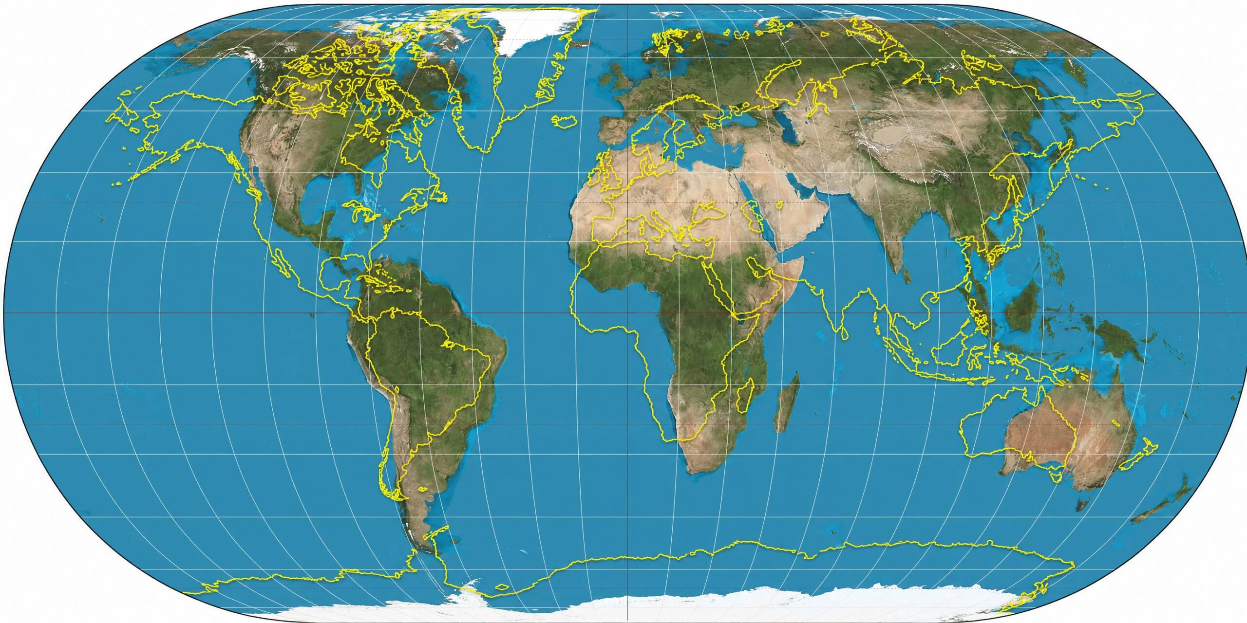
Today’s proposal comes from the school itself: when Boston, in 2017, chose the Gall-Peters projection, three cartographers (Bojan Šavrič, Bernhard Jenny and Tom Patterson) remained convinced of the idea of respecting the areas, but dissatisfied with the result and those stretched shapes. So, in 2018they designed a new one: Equal Earth, inspired by the Robinson projection (first presented in 1963 by Arthur H. Robinson). This is a new equivalent pseudocylindrical projection for planispheres, created “to provide a visually pleasing alternative to the Gall-Peters projection, which some schools and community groups have adopted as a matter of equity.”
The goal is balance: to get a projection equivalentwhich maintained the actual proportions of the continents, showing the developing countries in the tropics and the developed countries in the north at the correct dimensions, but also pleasant to look at, with the curved sides that suggest the roundness of the planet and the continents with recognizable shapes. A compromise that is not proposed as “the real map”, but as the right one enough for daily and respectful use.
The result is:
- An overall shape similar to that of the Robinson projection (which, while popular and pleasing to the eye, is not as equivalent as the Equal Earth);
- The curved sides of the projection, which suggest the spherical shape of the Earth;
- The straight parallels, which make it easier to compare the distance of places north or south of the equator.
What will really happen after the vote
After the vote, will anything change? The change will probably be slow and patchy.
Togo has already declared that it intends to update its school materials by the end of 2026; France has committed to leading the way with the adoption of Eckert IV at the bureaucratic level, and it is likely that other governments and international organizations may follow.
However, Web Mercator will continue to be used in online mapping services: Google, despite having introduced a horizontal view in 2018 3D globeit only shows it when you zoom out a lot, while still using Web Mercator in coordinate systems. The UN vote will initially act more on symbols (the maps on the walls, on books, in the imagination) than on technology.
The truth is that there is not, and cannot exist, a perfect map. The mathematician Carl Friedrich Gauss demonstrated it with his Theorema Egregium (the notable theorem): a sphere cannot be flattened onto a plane without deforming it. Every map of the world, therefore, is a necessary distortion: it can preserve areas or shapes or angles or distances, but never everything together.
Choosing a projection means deciding what we are willing to distort, what to put at the center and what on the margins, and is therefore a cultural and political choice. For centuries we have used a projection created for a specific purpose, navigation, as a general representation of the world, accepting the strong distortion of surfaces at high latitudes, while now the UN vote is trying to change this perspective: as the Togolese Foreign Minister Robert Dussey summarized: «A correct map does not change the geography of the world. It changes the way we see it.”